
Would you like to save this?
A 1961 E-Type and a Pontiac Aztek were both built to stop traffic. Only one still does. The difference isn’t age or money — it’s proportion, honest materials, and the restraint to leave well enough alone. Some shapes were right the day they were drawn and stayed right. Others chased a trend and died with it. Here are the cars that show, fender by fender, why good design outlives the calendar while bad design drags its birth year around like a license plate you can’t unbolt.
Please note that some of the images in this article were created with the assistance of AI.
1961 Jaguar E-Type: Proportions More Powerful Than Fashion
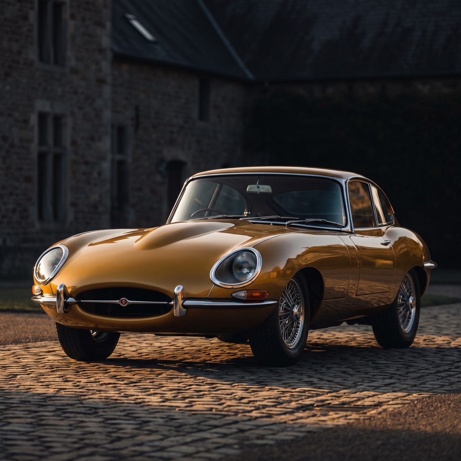
Enzo Ferrari reportedly called it the most beautiful car ever made, and he was not in the habit of complimenting the competition. Look at the bonnet. It runs forever, swallowing the front wheels and forcing your eye all the way down before it even finds the grille.
That length is the whole trick. The cabin sits far back, the overhangs are tiny, and nothing interrupts the line from nose to tail — no fake vents, no body cladding, no chrome where chrome wasn’t earning its keep. Six decades on, it still reads clean rather than old.
Pontiac Aztek: Trend Forecasting Still Could Not Create Beauty
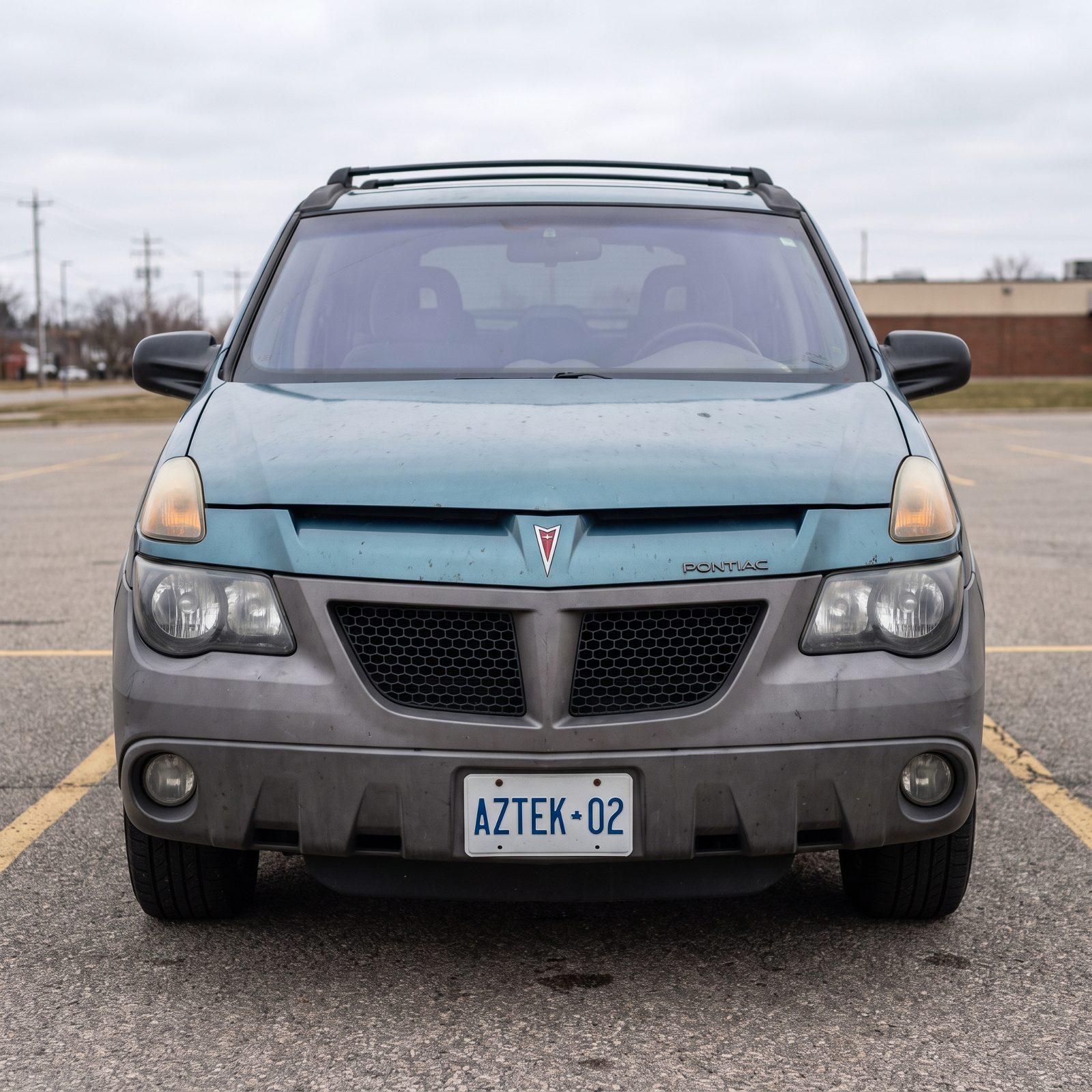
The Aztek is the cautionary tale every design school should hang on the wall.
GM researched it to death — focus groups, trend data, the works — and it still landed with mismatched proportions: a tall body, a tiny greenhouse, and plastic cladding broken into so many angles your eye never finds a place to rest.
Honest confession: we actually respect what it tried to do under the skin. The practicality was ahead of its time. But that practicality got stapled to a shape that argued with itself at every panel gap, and no amount of forecasting saves a car whose masses refuse to get along.
1963 Porsche 911: A Simple Silhouette That Barely Changed
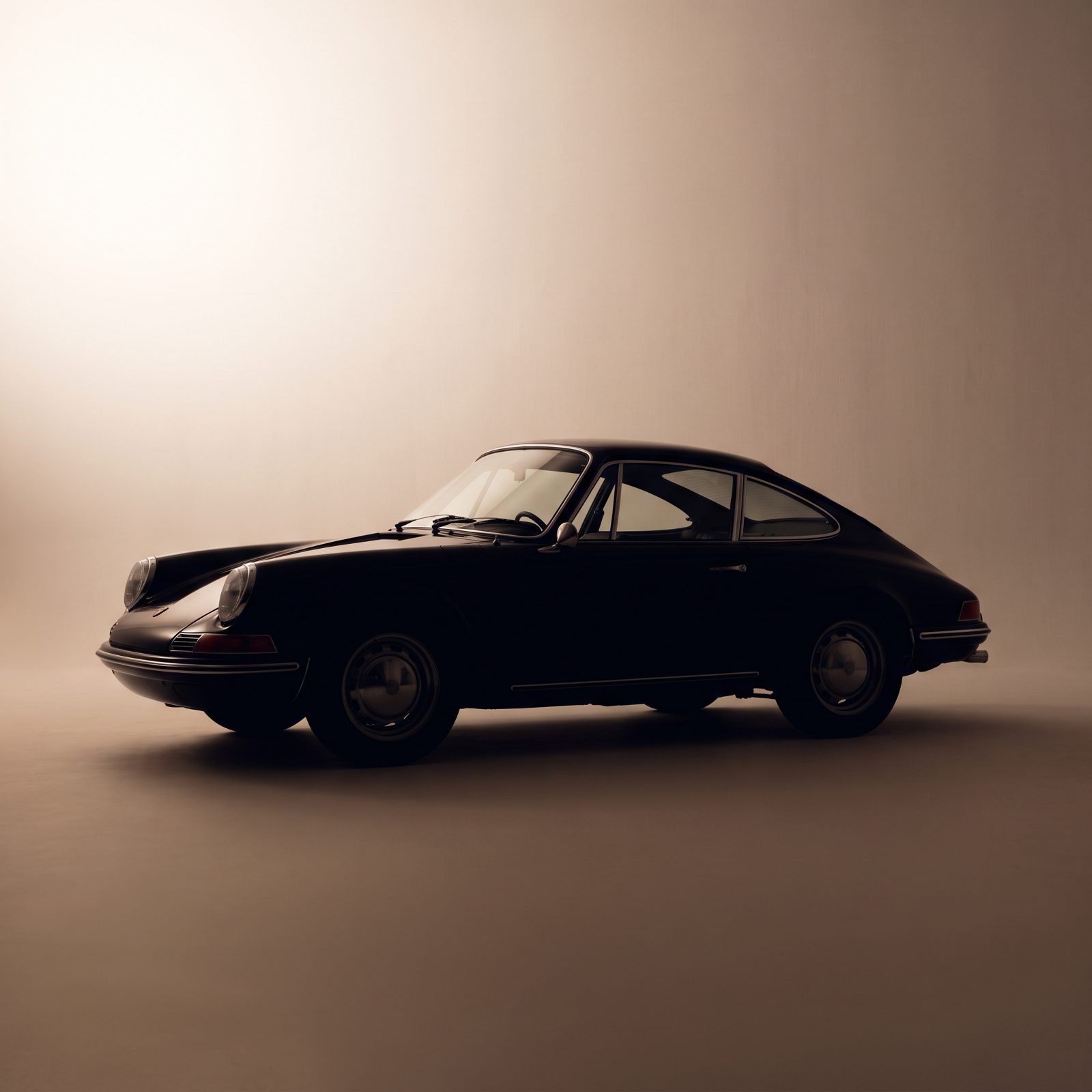
Put a 1963 911 next to a current one and a stranger could still name the family. That continuity isn’t laziness — it’s a shape so resolved that every generation since has only dared to refine it.
The magic lives in the roofline: one unbroken curve from the windshield down over the engine. No spoiler shouting for attention on the original, no dramatic creases, just a teardrop that happens to be gorgeous. Simplicity is harder to draw than drama. That’s why most cars reach for drama instead.
1964 Lincoln Continental: Formal Lines Without Fussy Ornament
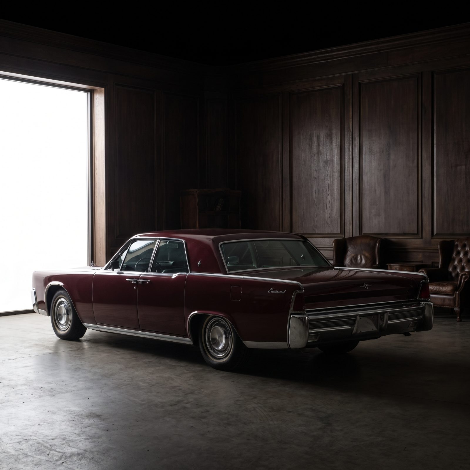
Detroit in the early sixties was drunk on chrome. The 1964 Continental walked into that party and ordered water.
Flat slab sides, a single sharp crease running the length of the body, almost no decoration at all. The luxury came from proportion and material rather than garnish. Where rivals piled on fins and jewelry, the Continental said less and meant more.
And that restraint is exactly why it still looks expensive. Trends date a car fast. A clean straight line with good chrome around the glass doesn’t carry a year stamped on it.
Chrysler PT Cruiser: Instant Nostalgia That Aged Twice as Fast
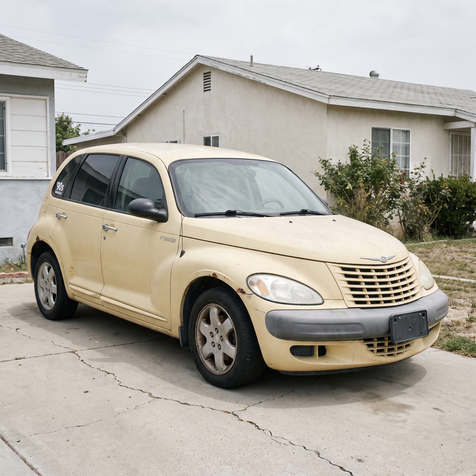
The cruel thing about borrowed nostalgia? It borrows the clock too.
The PT Cruiser dressed a cheap economy platform in 1930s hot-rod cues. For about a year everybody wanted one. Then the costume started to show. A retro design doesn’t age from one era, it ages from two at once — the era it copied and the era it was built in.
Underneath those fender bulges sat short, tall, top-heavy proportions no amount of chrome could rescue. When the trend passed, there was nothing structural left to admire, and that’s the whole gap between a style and a gimmick.
1965 Ford Mustang Fastback: The Roofline That Still Looks Fast
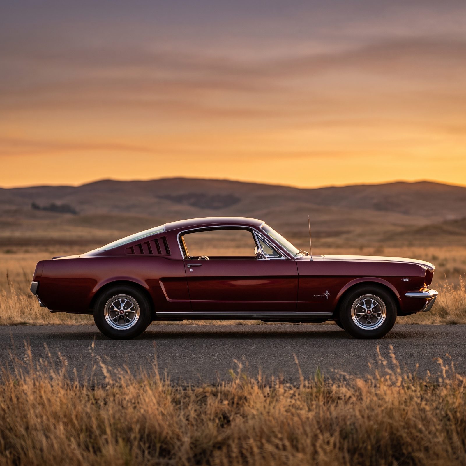
Long hood, short deck, roof sloping all the way to the tail. The Mustang fastback drew the posture of a car that’s already moving before you turn the key.
That proportion — hood dominant, deck tucked short — became the template for the whole pony-car breed. It worked because it suggested motion honestly, the fastback roof flowing into the body instead of being bolted on as an afterthought.
1963 Chevrolet Corvette Sting Ray: Drama Built Into the Shape
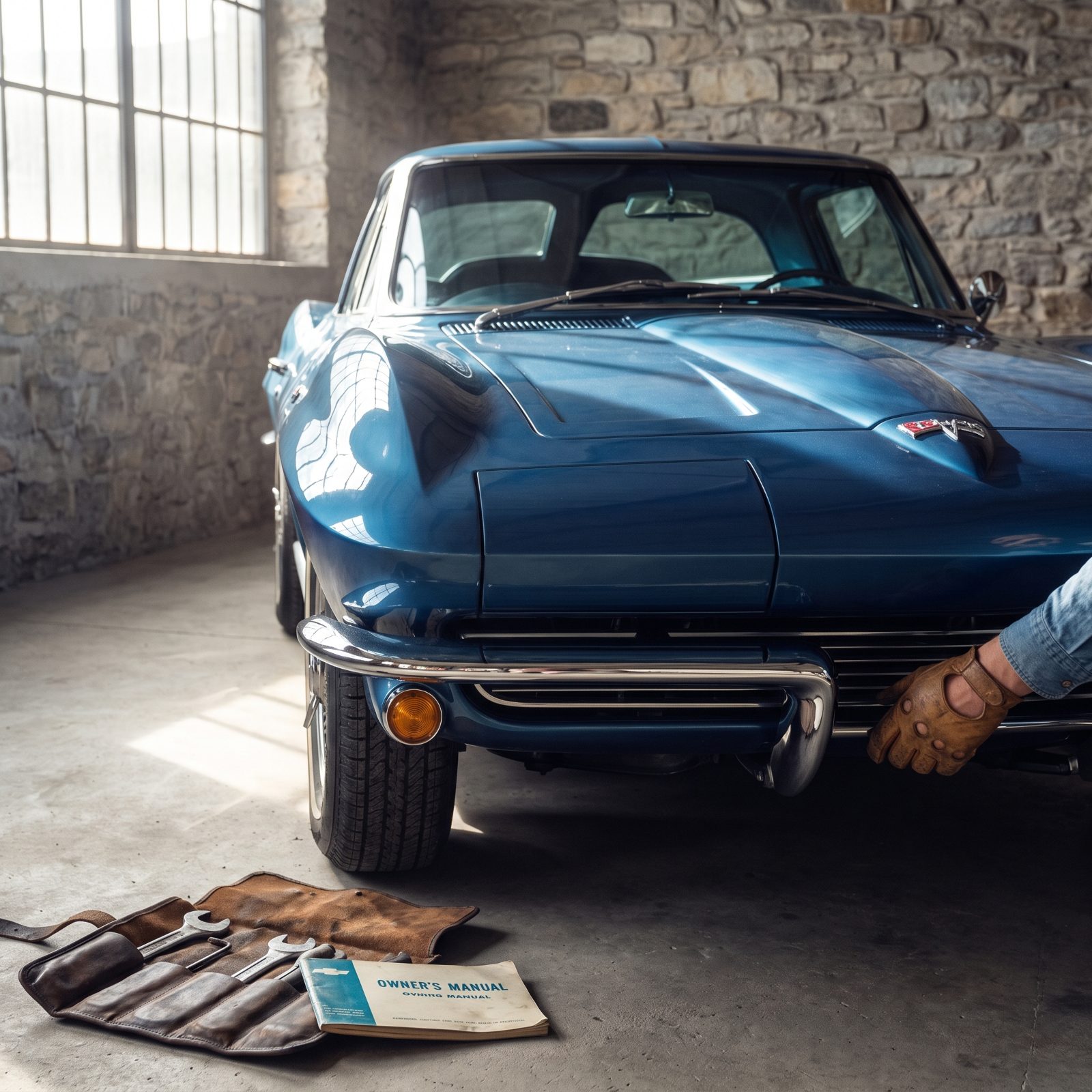
The Sting Ray proves drama can age gracefully, as long as it lives in the metal instead of being bolted on afterward.
Those peaked fenders, the pinched waist, the pointed tail, the split rear window — all one continuous sculpture. Chevrolet only used that divided window for a single year, and collectors have been fighting over it ever since. Theatrical, sure, but it’s theater carved into the structure.
Compare that to a car chasing excitement with scoops and wings glued on. The Corvette didn’t decorate a shape. It was the shape. Which is why it still looks deliberate rather than desperate.
1970 Range Rover: Utility Made Visually Honest
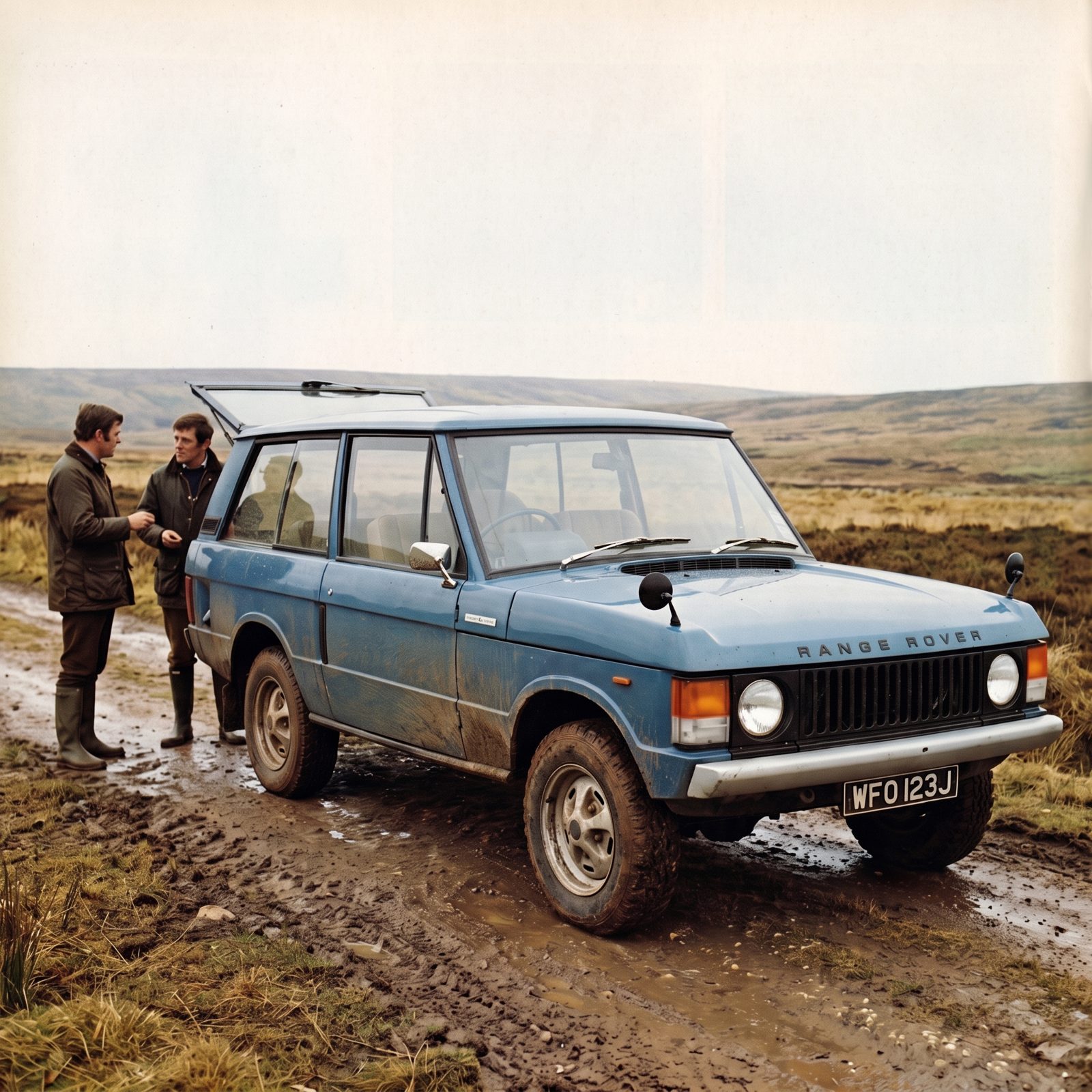
The original Range Rover looks honest because it is. Flat glass, because flat glass is cheaper and easier to see through. Boxy body, because boxes hold the most. Thin pillars, because the engineers weren’t hiding anything.
Nothing on it pretends to be something else. The shape followed the job, and the job was clear. That’s the oldest rule in design and still the most reliable one: when form tells the truth about function, it rarely looks silly a decade later.
Half a century on, it reads purposeful and quietly good-looking — more than most of the chunky, pretend-tough SUVs copying it today can claim.
Cadillac Cimarron: Economy-Car Bones Exposed by Luxury Trim
Would you like to save this?
You can’t dress up a shape it doesn’t own.
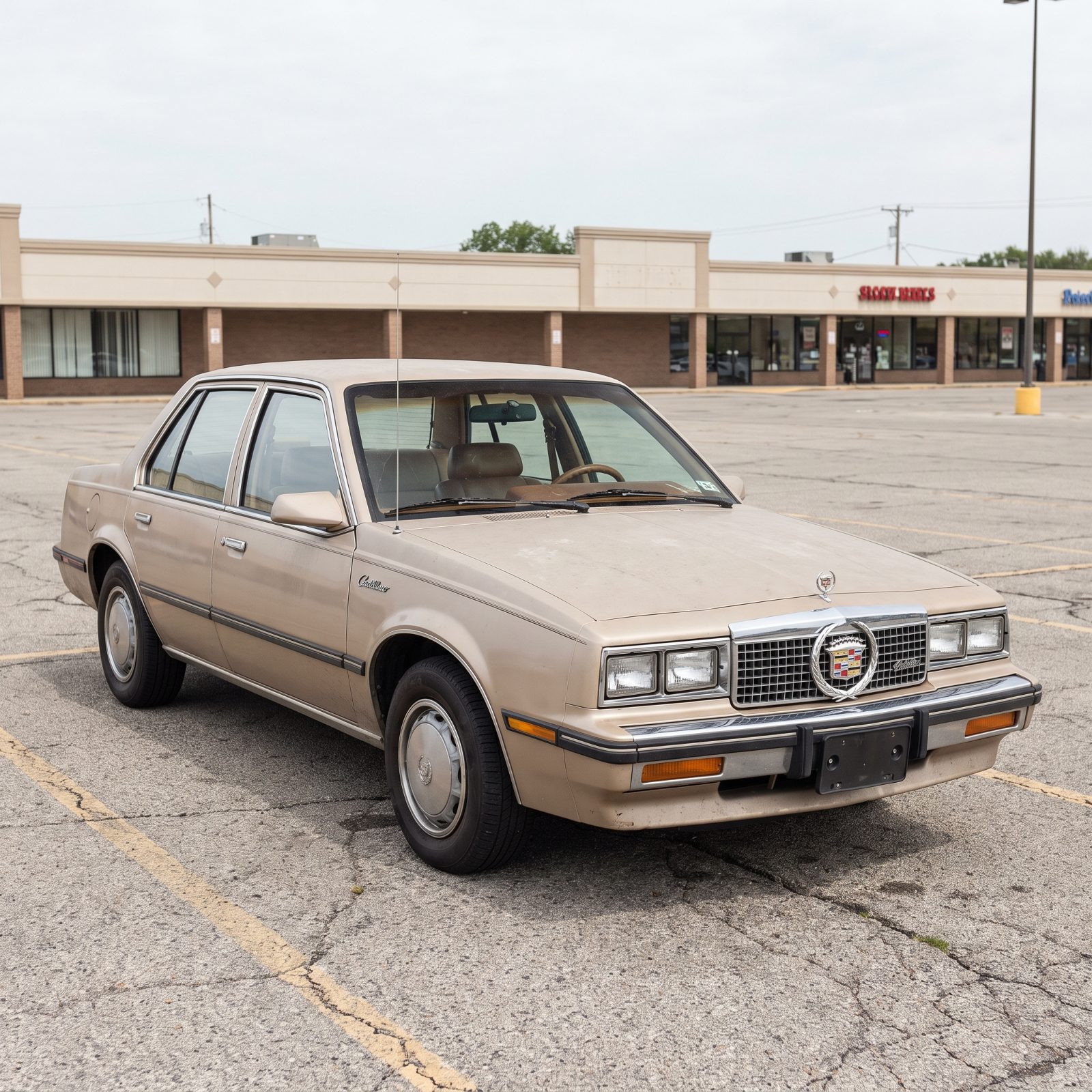
The Cimarron was a Chevy Cavalier wearing a Cadillac tuxedo. Same compact economy-car proportions, same short hood and tall narrow body, now hung with chrome, a padded roof, and a wreath-and-crest badge.
The trim only made the bones more obvious. A grille that grand needs a hood that long, and the Cimarron didn’t have one. Every piece of borrowed luxury pointed straight back at the modest car underneath it.
Call it a lesson in why detailing can’t fix proportion. Ornament amplifies what’s already there. On a good shape it reads as confidence; on the wrong one, as costume.
1969 Dodge Charger: A Coke-Bottle Profile With Lasting Presence
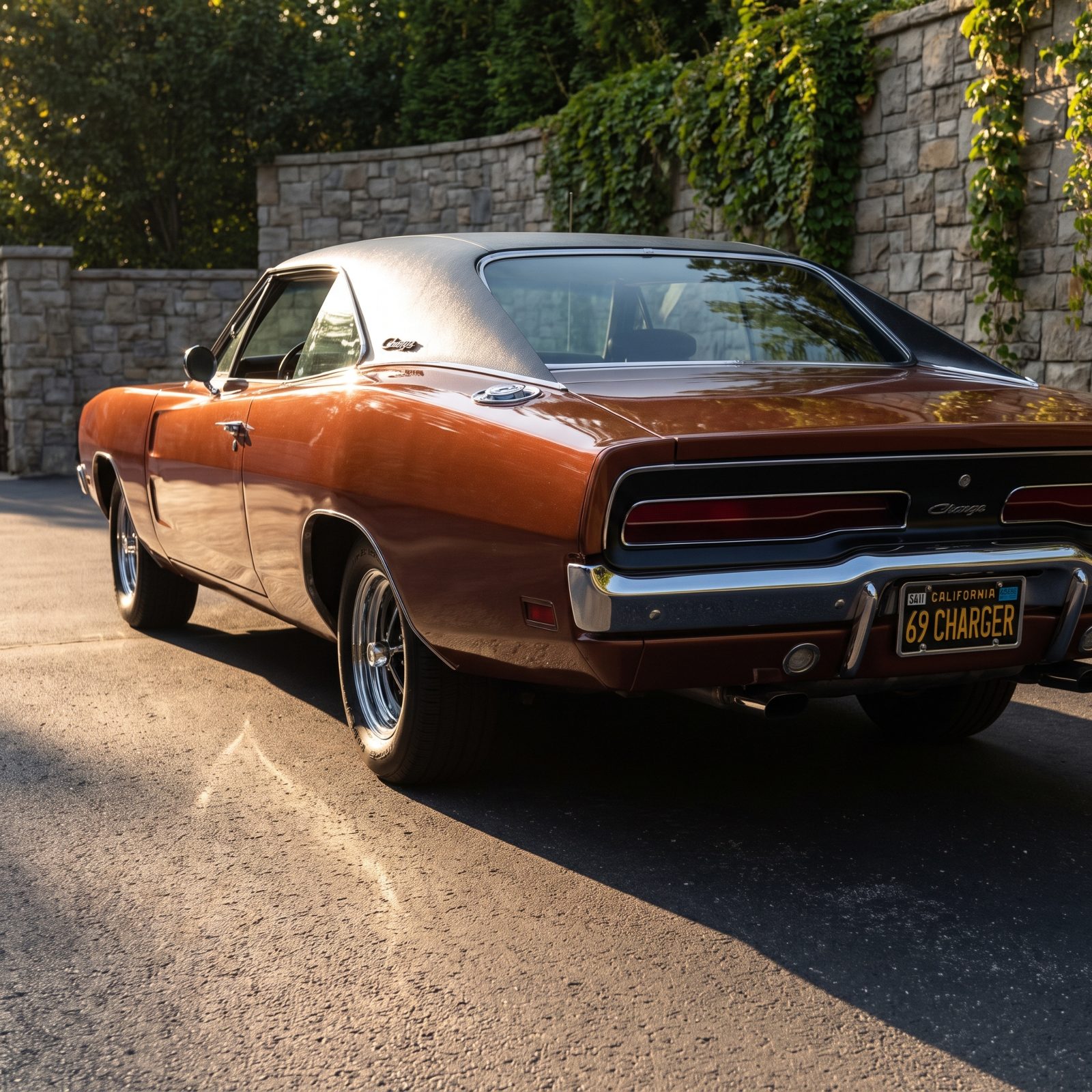
Stand beside a ’69 Charger and the body curves in at the doors, then swells back out over the rear wheels. That’s the coke-bottle line, and it gives the car the stance of something crouched and waiting.
The details earn their keep too. That full-width grille with hidden headlamps reads as one clean black band, and the flying-buttress sail panels tuck the rear window into a tunnel instead of plastering on chrome. Every move serves the mass.
1972 BMW 3.0 CS: Thin Pillars and a Glassy Cabin
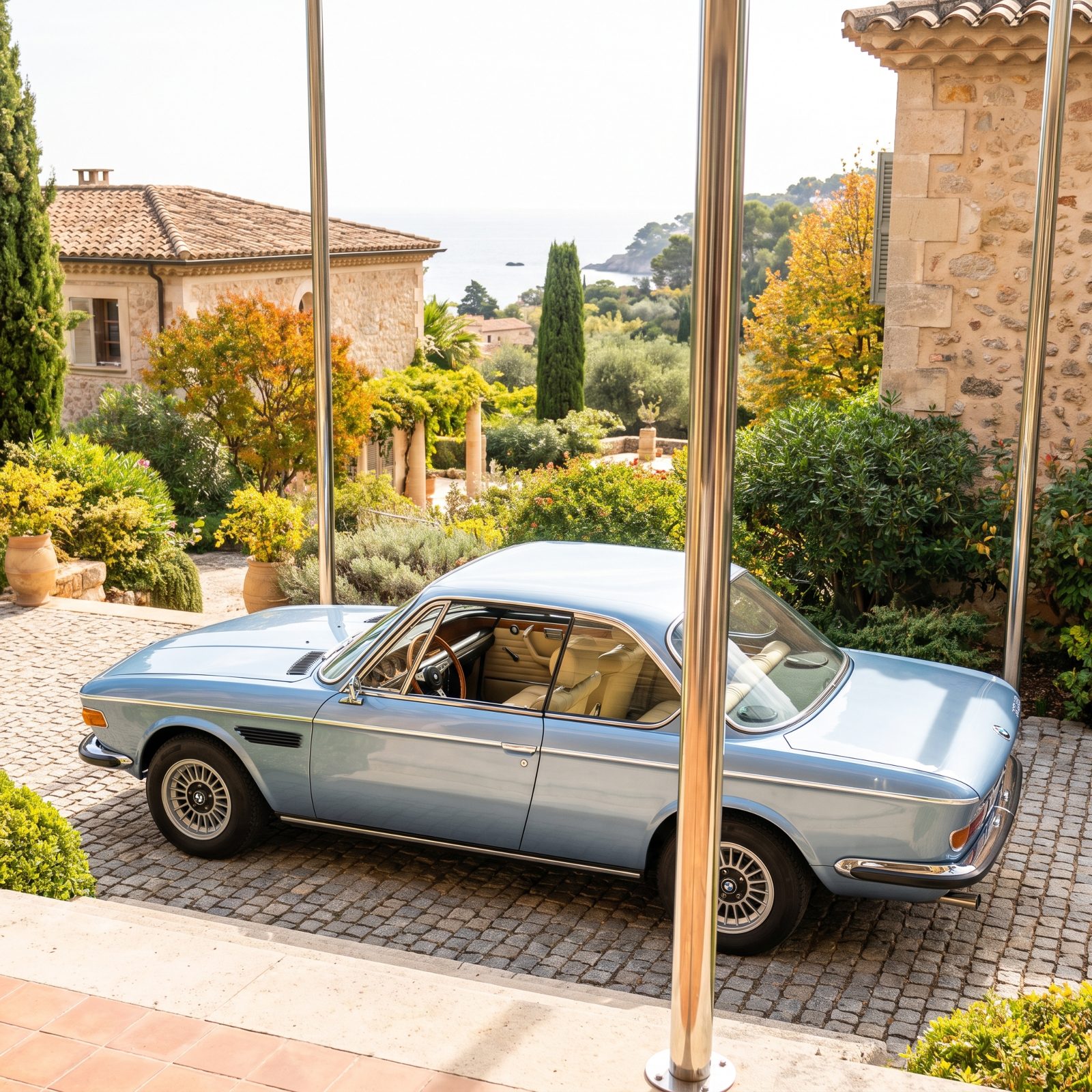
Sit in one and you understand the whole thing. Glass everywhere, pillars thin as a pencil, windows that roll down into nothing while the roof seems to hover. That much visibility is almost gone from modern cars, strangled by crash standards and a fashion for gun-slit windows.
The 3.0 CS ages well because it isn’t trying to look fast. Long hood, set-back cabin, slim chrome bumpers sitting flush instead of bolted on like an afterthought — the proportions carry it. Nothing dates faster than decoration, and this car barely has any.
1974 Lamborghini Countach: An Extreme Shape That Became an Icon
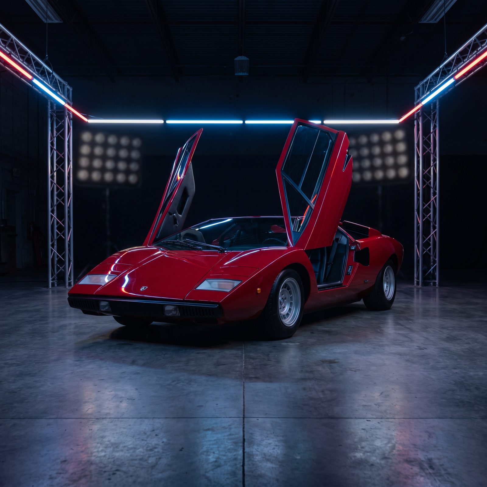
A child drawing the fastest car imaginable in 1974 drew this. Then Lamborghini built it. The Countach should have been a flash in the pan, the kind of excess that curdles into embarrassment within a decade.
It didn’t. Here’s the twist: extreme and confident can outlive tasteful and timid. The early LP400, before the wings and flares piled on, is nearly pure geometry — flat planes, folded edges, one unbroken idea. Because it committed completely, there’s nothing to peel back and date. It never pretended to be subtle, so it never has to apologize.
Second-Generation Ford Taurus: Rounded Innovation That Became a Time Stamp
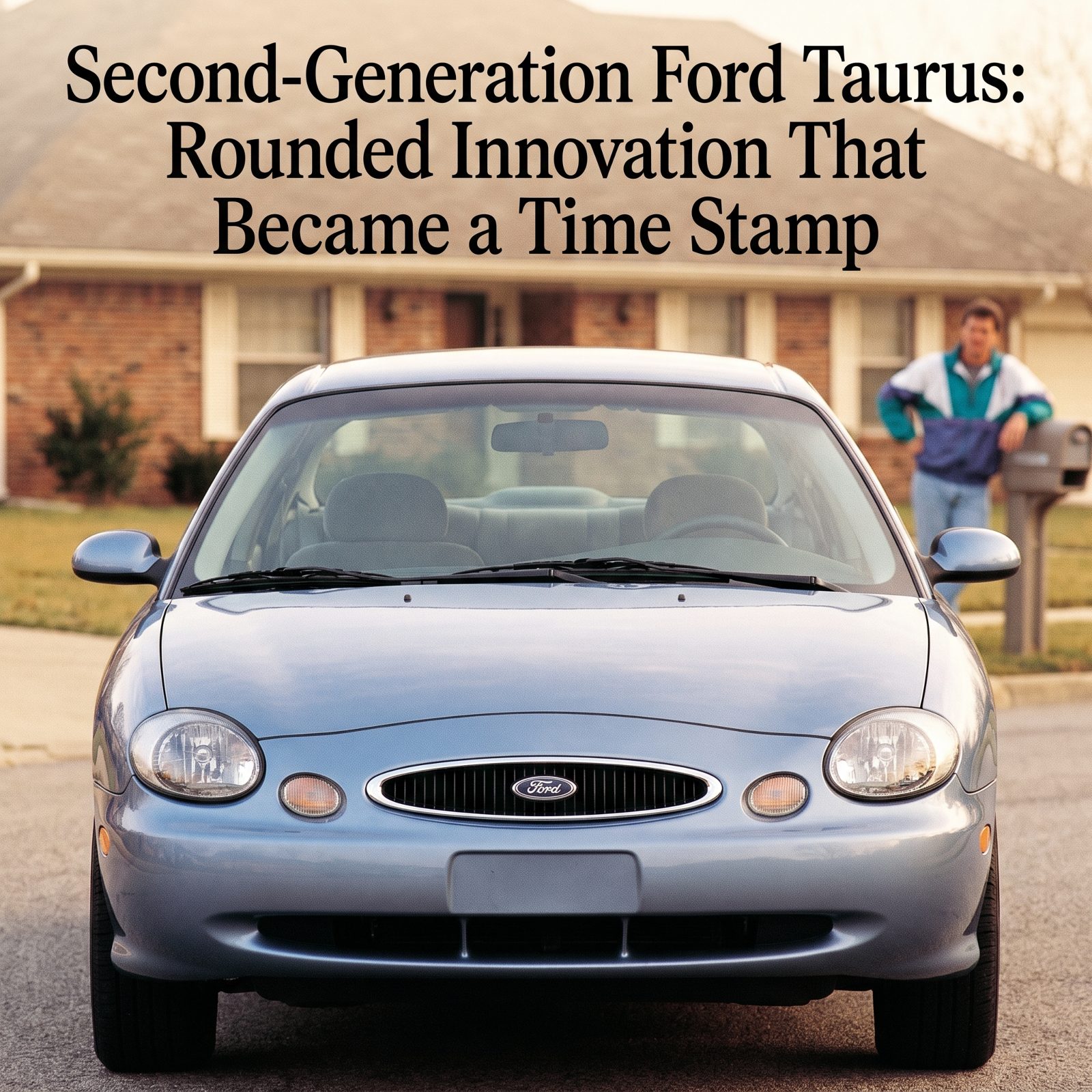
Ford went all in on the oval. Oval grille, oval gauges, oval everything. Bold for 1996, a genuine swing at reinventing what a family sedan could look like.
And then the opposite of the Countach happened. This design committed to a trend rather than a shape. Round-everything was the late-90s dialect, and the 1996 Taurus spoke it fluently — which means it now reads as that year and no other. You can nearly date the photo from the grille alone.
1975 Volvo 240: Boxiness That Outlived the Joke
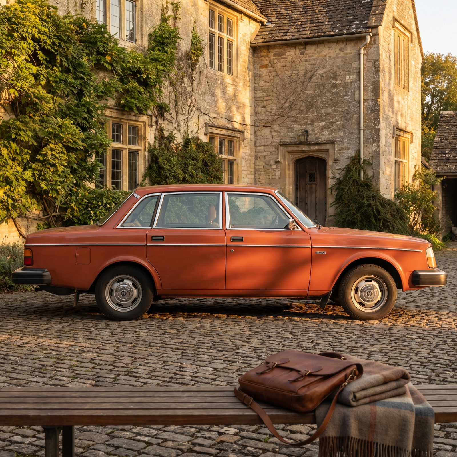
For years the 240 was a punchline — a brick with seatbelts, the professor’s car, the one that would not die no matter how hard its owner wished it would.
Look now. The boxiness that made it the joke is exactly why it survived. Straight lines don’t chase fashion, so fashion can’t abandon them. The tall glass, the flat panels, the honest shut lines all say the same plain thing: built to last and look like what it is. Something that never tried to be pretty can’t go ugly. The 240 just waited everyone out.
1976 Volkswagen Golf Mk1: Crisp Geometry Without Decoration

Giorgetto Giugiaro drew it with a ruler and good sense. Folded planes, a thick signature C-pillar, and almost nothing else — no cladding, no fake vents, no flourish bolted on to look modern.
That restraint is why it still looks right. Decoration is a promise to a specific decade, and the Golf refused to make one. Crisp geometry, correct proportions, zero ornament. Strip a design down to only what it needs and you also strip out everything that could later look silly.
1977 Pontiac Firebird Trans Am: Period Excess That Became Character
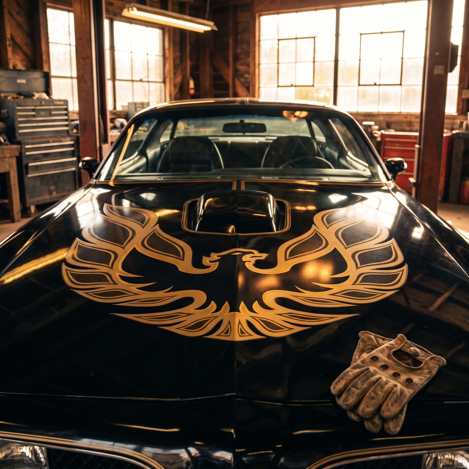
The screaming chicken on the hood. Gold against black, a shaker scoop, T-tops, and all the swagger the late 70s could muster. By every rule of good taste, this should have aged like a pair of disco pants.
It doesn’t, and the reason is honesty. The Trans Am never pretended to be refined. It was loud on purpose, and a design that fully owns its excess becomes character instead of regret.
Subaru B9 Tribeca: A Grille Fashion That Overpowered the Whole Car
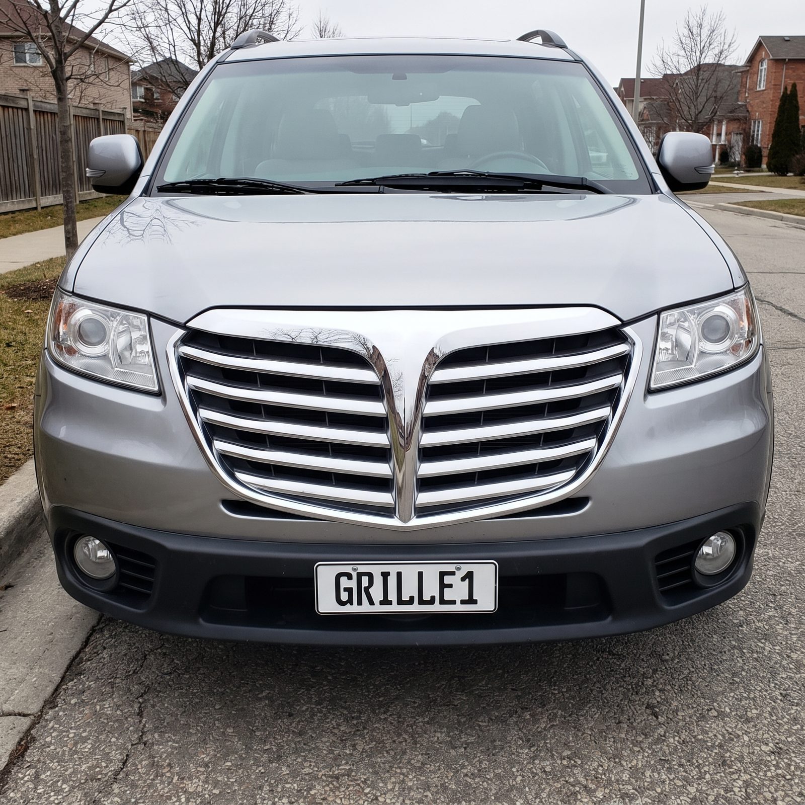
The body underneath is fine. Reasonable proportions, inoffensive stance, a perfectly sensible family SUV. Then there’s that grille.
The split-wing, aircraft-nose front end was styling fashion at its most confident, and it swallowed the entire car whole. One loud gesture pinned the Tribeca to its exact year so hard that Subaru redid the nose within a few seasons.
Clearest lesson on the list. A single trendy detail, applied with enough drama, can date everything around it. Proportions and simplicity grow old gracefully. A fashionable face does not.
1978 Saab 900: An Unusual Shape With a Clear Purpose
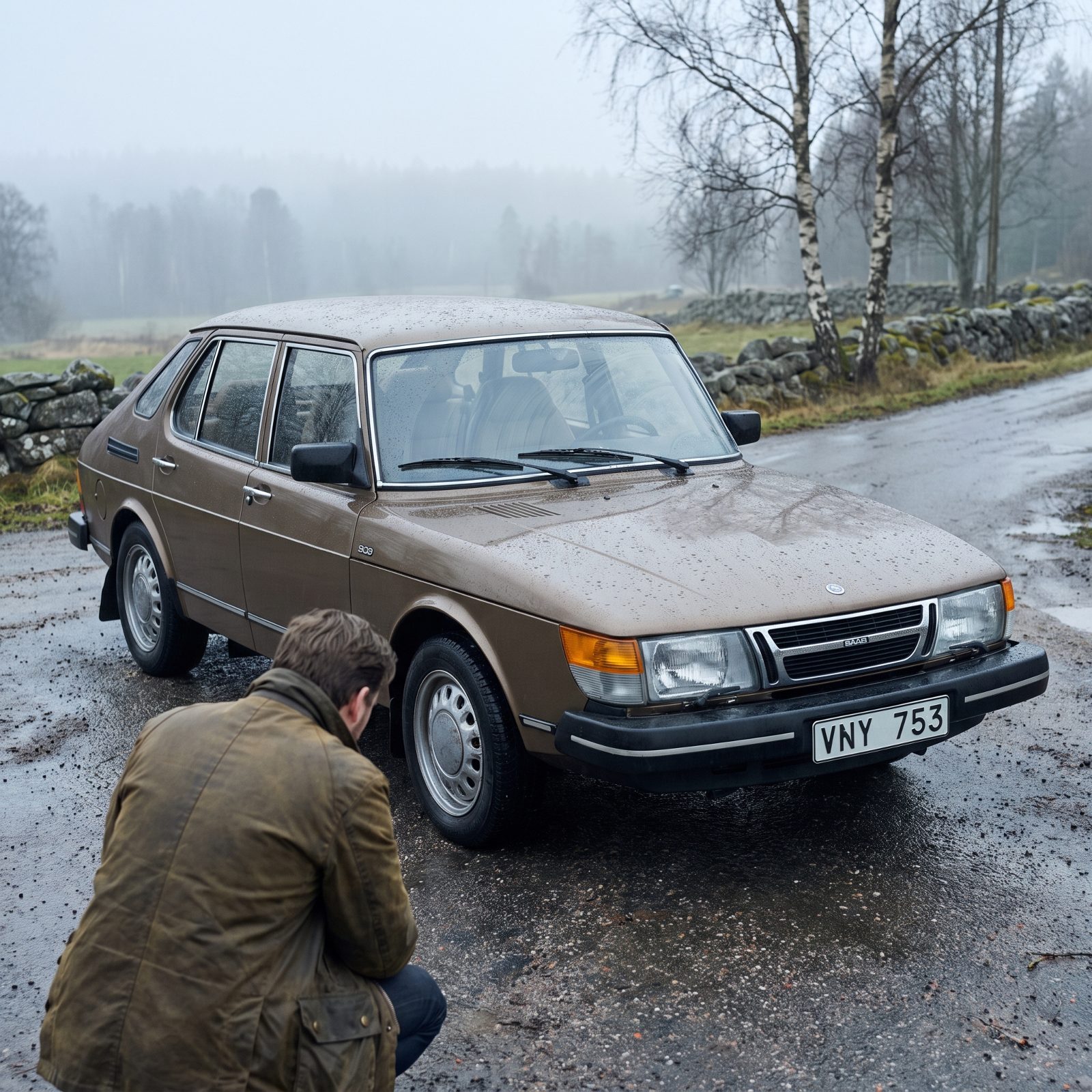
Odd car. The curved windshield wraps around like a cockpit, the nose slopes forever, and the whole thing looks like it was drawn by aerospace engineers who wandered into the car department by accident. Which is roughly what happened.
Strangeness with a reason ages differently than strangeness for show. Every unusual line on the 900 answers to aerodynamics, visibility, or the way Swedes think about driving in snow. Nothing’s weird for attention. That’s why the shape still feels deliberate decades on, while fashion-driven oddity curdles into dated. Function that shows its work earns the right to look unusual.
1981 DeLorean DMC-12: Stainless Steel Preserved Its Futurism
Would you like to save this?
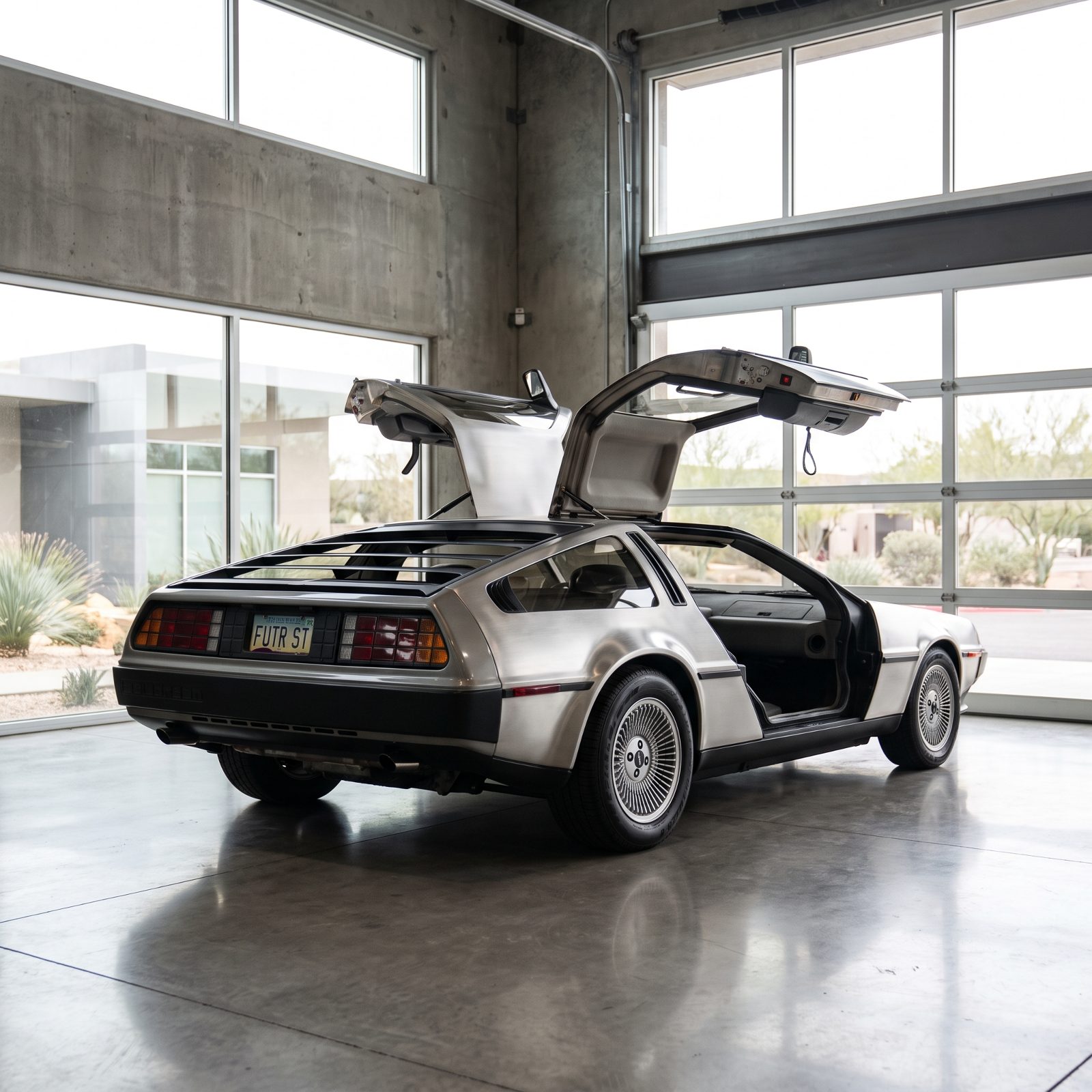
No paint. That’s the trick nobody mentions. The DMC-12 wears brushed stainless steel, which means it skipped the single thing that dates cars fastest — a color choice welded to a decade.
Paint fashion moves on. Avocado, harvest gold, the metallics of every era eventually scream their year out loud. Bare stainless just reflects whatever stands in front of it, forever neutral. Pair that with Giugiaro’s clean wedge, add nothing extra, and the DeLorean still reads as a car arriving from the future instead of one stranded in 1981.
1982 Mercedes-Benz W123: Solidity Visible From Across the Street
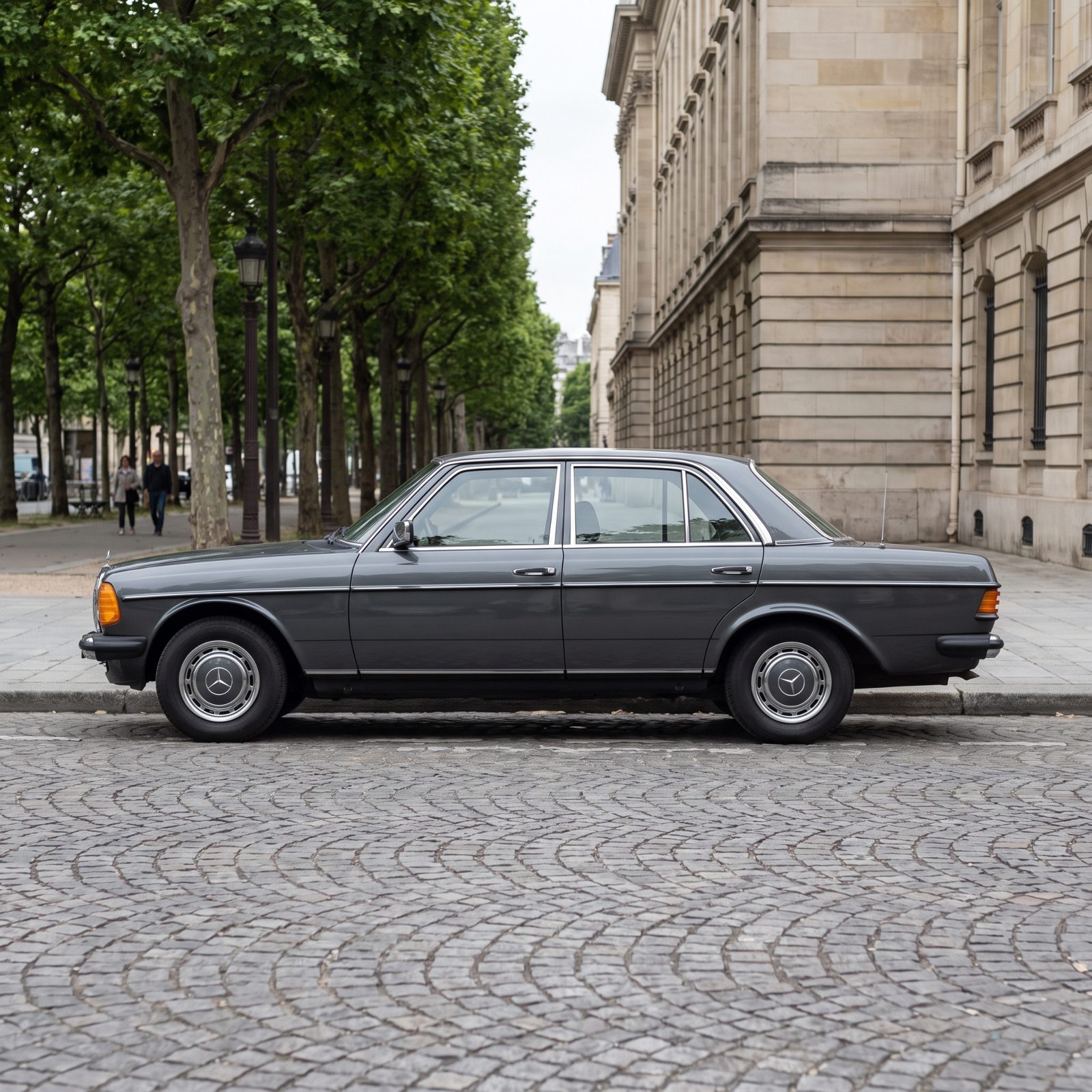
You can read the build quality from across the street. The W123 sits heavy and square, chrome bumpers thick enough to lean on, panel gaps tight enough to argue a case in court. It looks engineered rather than styled, and that distinction is everything.
Mercedes wasn’t chasing a look here — they were solving for durability, safety, and the kind of longevity that put hundreds of thousands of these on the road still running today. The honesty shows. A car designed around how long it would last, rather than how current it would seem, ends up looking current longer than anything that chased the moment.
And there’s the whole thread of this list in one car. Proportions over decoration. Function made visible. Nothing bolted on to flatter a single year. Design that tells the truth about what a thing is simply doesn’t go out of date, because there was never a fashion for it to fall out of.
SsangYong Rodius: Conflicting Rooflines That Never Reconciled

Some cars age because trends move on. The Rodius looks dated because it never agreed with itself on day one. The front third wants to be a sleek people-mover, but the rear half rises into a second, higher roofline meant to flatter third-row headroom, and the two volumes crash into a seam your eye keeps tripping over.
There’s a lesson sitting in a minivan nobody asked to study. A shape ages gracefully when its surfaces tell one story. The Rodius tells three. The long rear glass, the stepped roof, the heavy tail — all pulling in different directions, and no amount of fresh paint fixes it.
1983 Audi 100: Aerodynamics Without the Cartoon
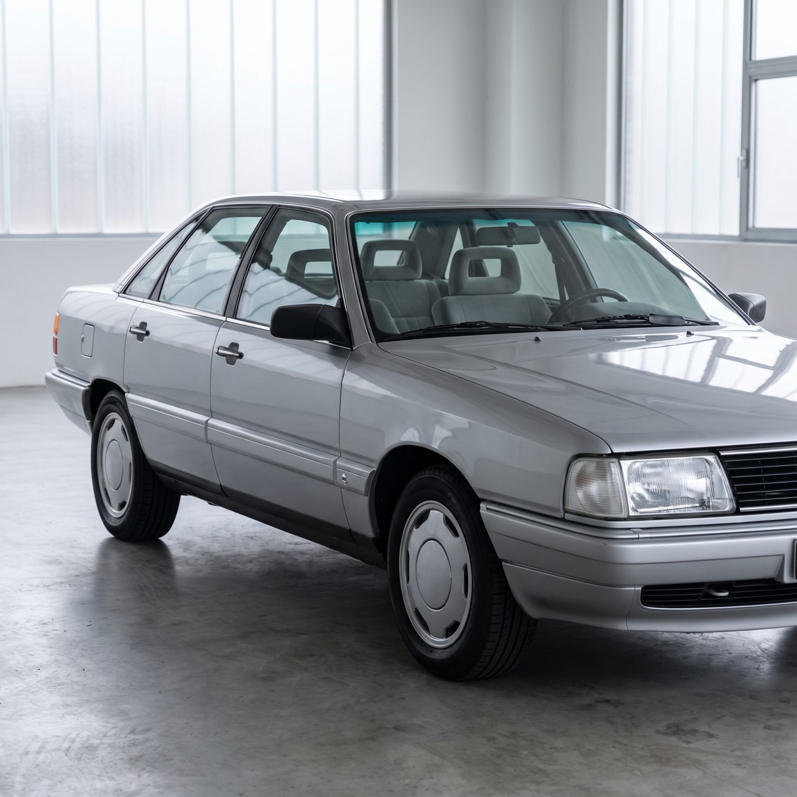
The 1983 Audi 100 chased a drag figure that embarrassed everything around it, and it did so without a single gimmick bolted on. No fake vents. No plastic skirting pretending to be a spoiler. Just flush glass, a smooth flank, and door handles that sit nearly level with the body.
That restraint is why it still reads modern instead of retro. Audi solved the aerodynamics with the shape itself rather than decorating the problem, and you only have to compare it to the cars that chased efficiency a decade later — scalloped bumpers, plastic cladding everywhere — to see the gap between solving something and dressing it up.
Honesty wears well. The 100 never had to shout about being slippery, which is exactly why it still looks it.
1984 Toyota Land Cruiser FJ60: Honest Utility That Earned Its Patina
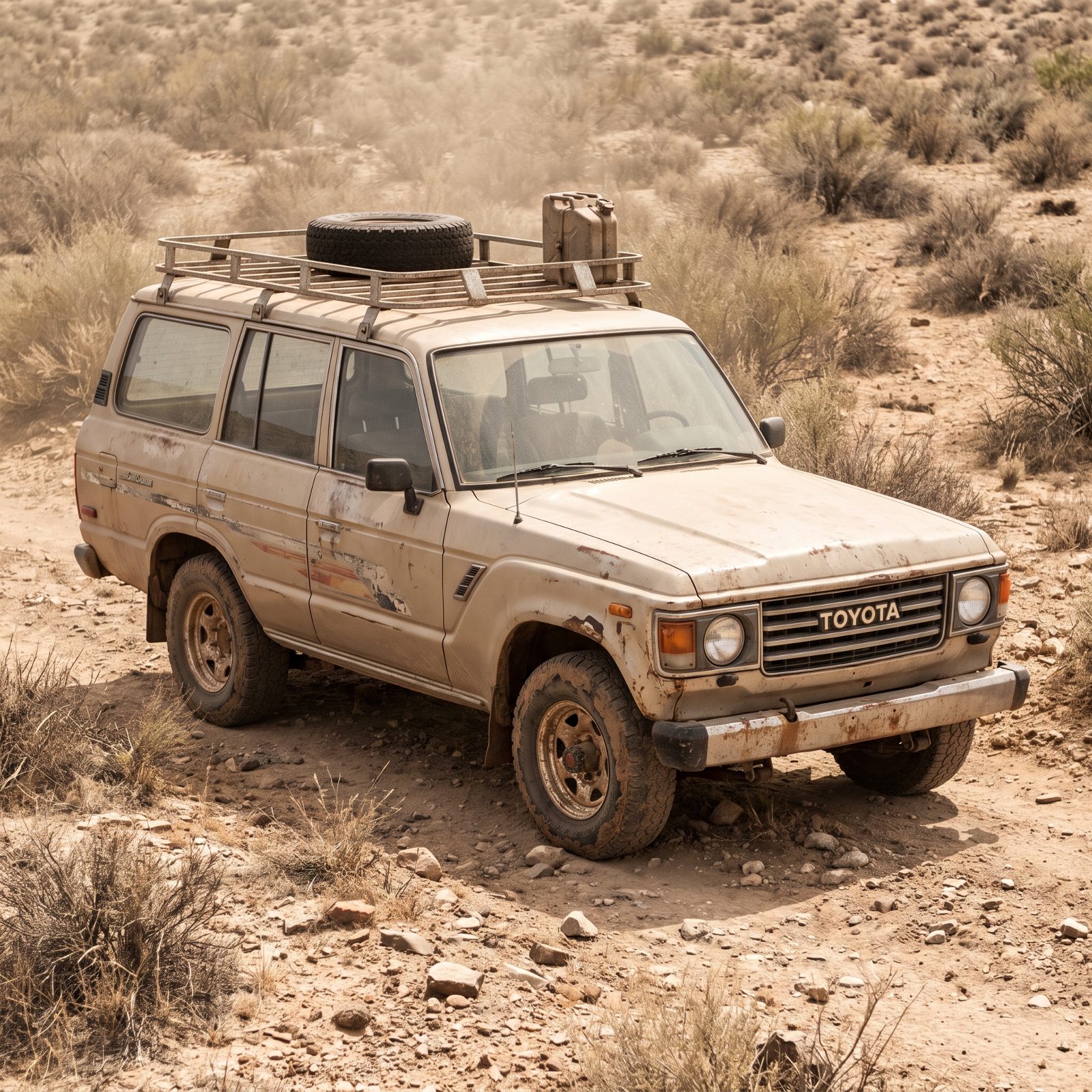
Boxy and upright, flat glass all around, wheel arches you could trace with a ruler. The FJ60 was never trying to be pretty, and that’s precisely why it still looks right parked next to anything built since.
There’s no styling here to go out of fashion. Honest utility has no expiration date. The faded paint and the dents only make the thing look more like itself — the opposite of how a fashion-driven design ages. A car built to flatter the eye in 1984 dates the second the eye moves on, while a car built to do a job keeps doing the job and wears its years like a good pair of boots.
1985 Peugeot 205 GTI: Tiny Details on a Perfectly Plain Form
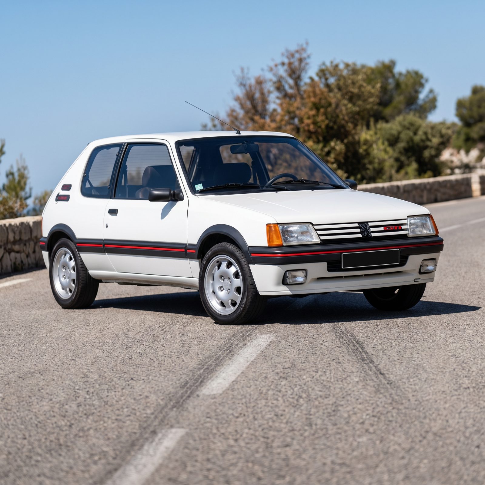
The body of a 205 is almost nothing — a plain little hatchback box with big windows and slim pillars. That plainness is the whole trick.
Because the form is so quiet, every small detail gets to speak: the red pinstripe around the grille, the modest arch extensions, the tidy wheels sitting flush in the corners. Peugeot understood that a calm surface lets a sharp accent land. Pile accents onto a busy body and they cancel out. Place one or two onto a plain one and they sing.
Four decades on, nothing here looks tortured. A simple form, it turns out, is the most forgiving canvas a designer ever gets handed.
1986 BMW E30: Balanced Proportions Before Cars Got Heavy
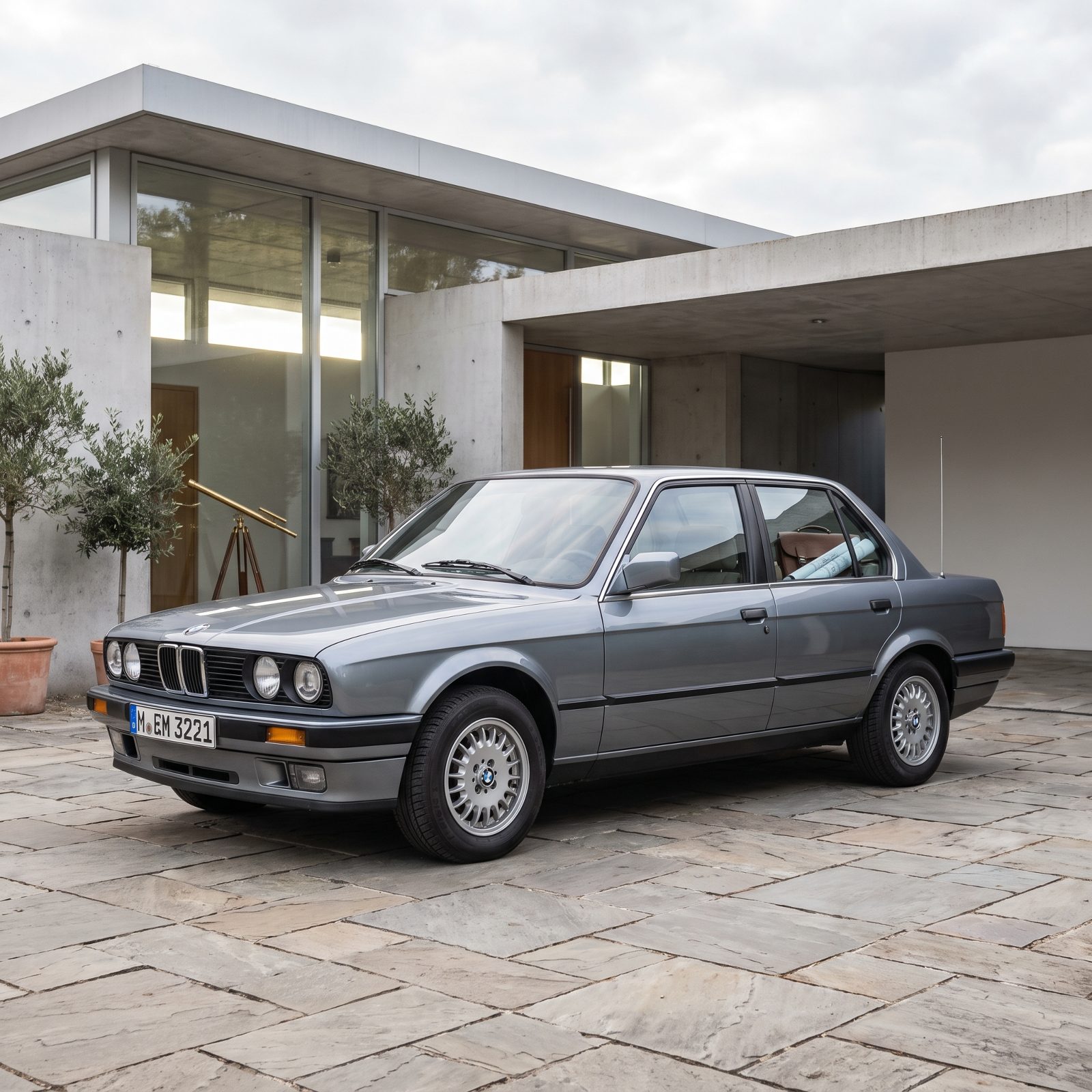
Look at the glass. The E30 sits low under a greenhouse that modern cars would kill for, with pillars thin enough to see around and overhangs trimmed to almost nothing. It looks light because it is light, and lightness is what ages well.
Here’s the quiet tragedy of modern car design. Crash rules and pedestrian regulations pushed cowls up, pillars thick, beltlines high — so every new car reads as a bunker on wheels. The E30 comes from the moment just before that shift, when proportions still got balanced for the eye rather than the test lab.
Mitsubishi Eclipse Cross: Too Many Creases Fighting for Attention

Count the lines. One slashes up through the doors, another drops across the rear quarter, a third splits the back glass in two, and the cladding fights all of them for your attention. The Eclipse Cross never gives the eye a quiet surface to rest on.
This is the inverse of the Peugeot lesson. When every panel is doing something, nothing stands out, and the whole thing reads as noise. Busy design ages fast because the busyness was the point — and the point was a trend. Trends curdle.
Give it a few more years. The creases will date it hard, the way a mid-2010s crossover already announces its birth year clear across a parking lot.
1987 Ferrari F40: Function Made Every Surface Memorable
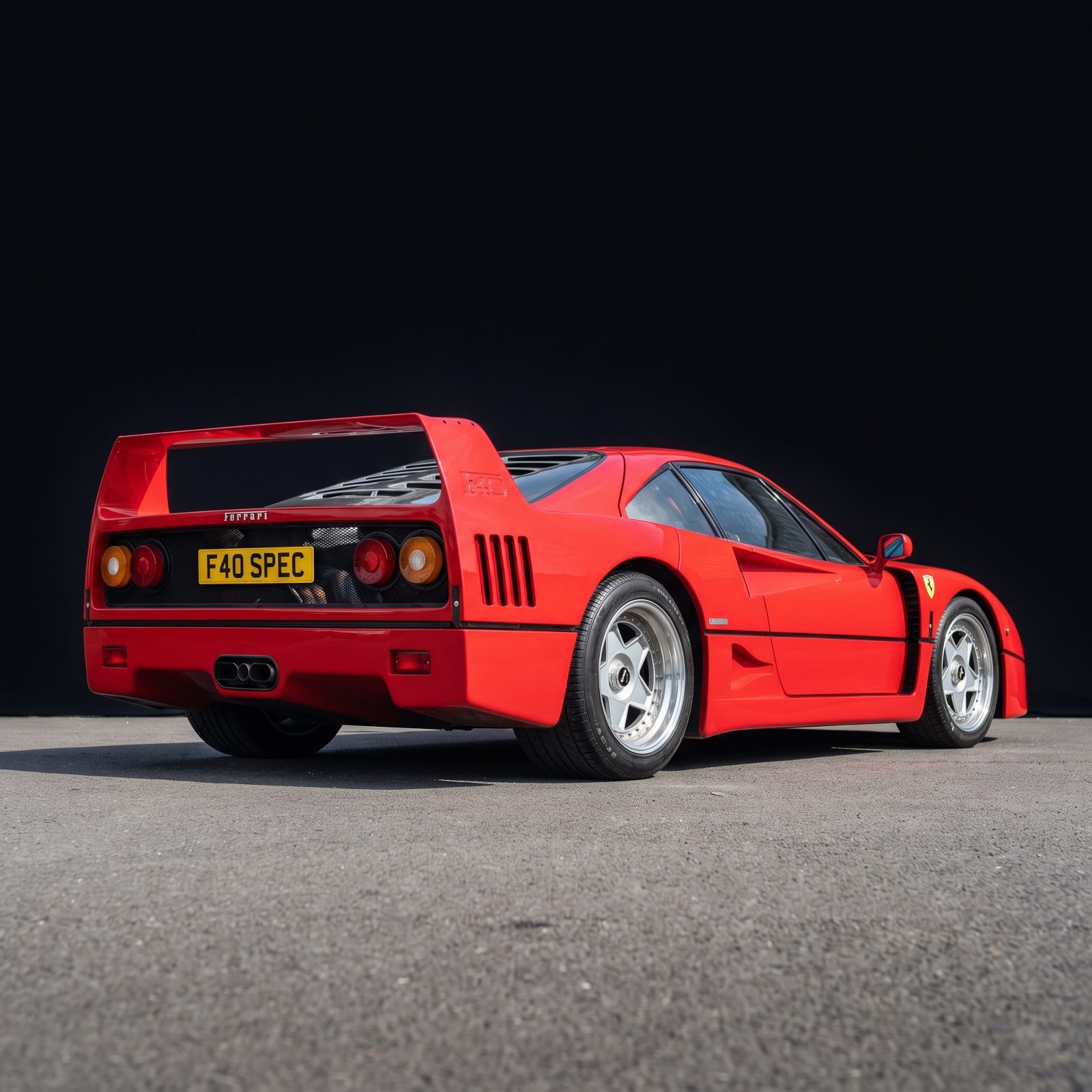
Every vent on the F40 is there because air needed to go somewhere. The giant rear wing makes downforce, the NACA ducts feed the brakes, the louvered cover lets heat escape. Nothing was styled. Everything was solved.
And that’s exactly why it will never look dated. A surface shaped by a decorator ages with the decorator’s taste. A surface shaped by physics ages with physics — which is to say not at all. The F40 is dramatic because its job was dramatic, not because a stylist went hunting for drama.
When form follows function hard enough, the result stops being a fashion and becomes a fact.
Stand next to one today and you feel nothing dated about it. That’s the reward for honesty.
1989 Mazda MX-5 Miata: A Friendly Face With Timeless Bones
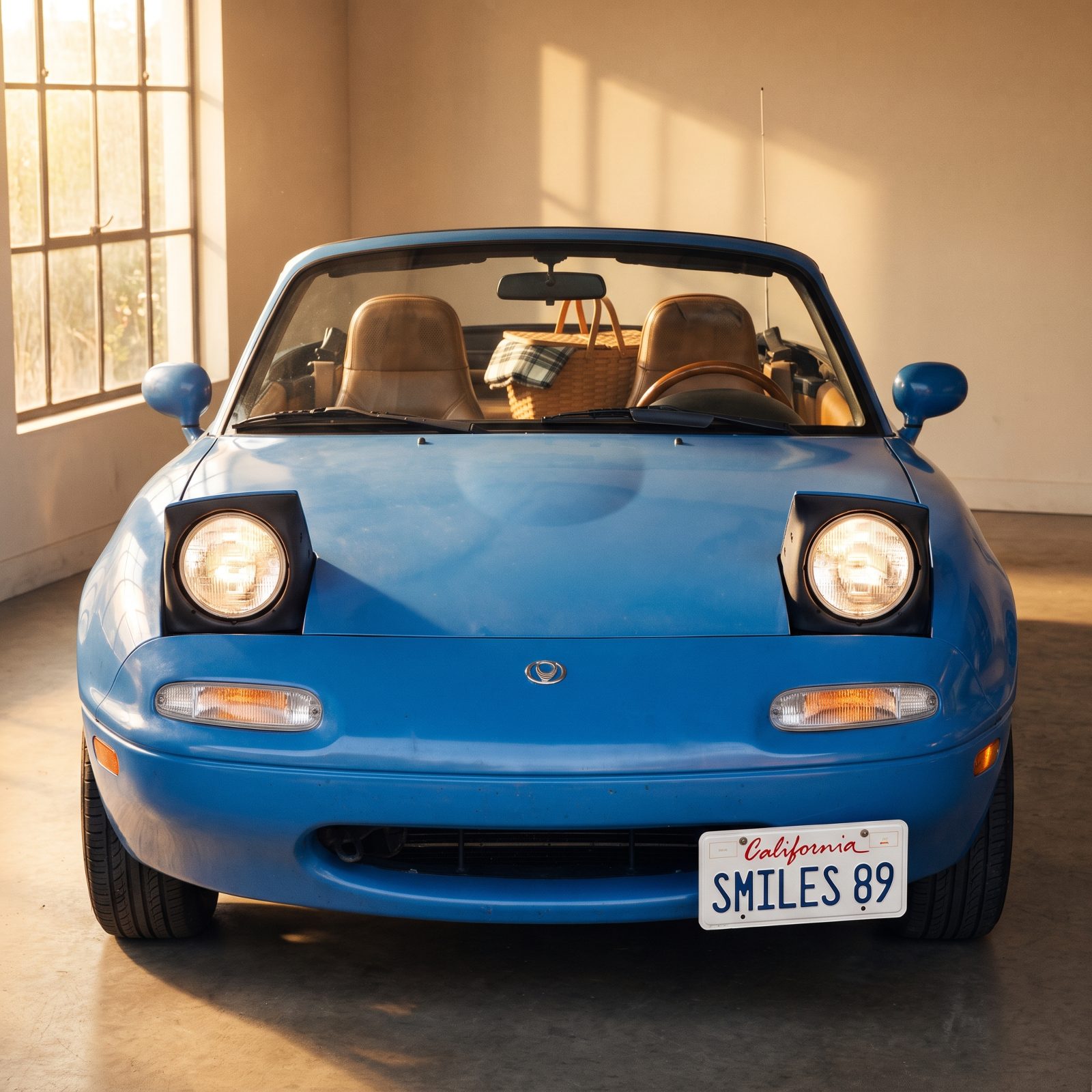
Round, small, and smiling. The original Miata has a face that reads friendly rather than aggressive, and three decades later that choice looks smarter than ever.
Nothing on this car tries to intimidate you. The surfaces are soft and uncluttered, the proportions near-perfect for a tiny roadster, and the whole thing got designed around driving joy instead of posturing. Cars built to look tough age the way tough-guy fashion ages — badly. The Miata was built to look happy, and happy doesn’t go out of style.
Second-Generation Toyota Prius: A Futuristic Profile Turned Period Piece

Would you like to save this?
When the second Prius landed, that long arcing one-box roofline looked like the future had parked in your neighbor’s driveway. Now it looks like exactly one year: 2004.
Here’s the paradox worth sitting with. A design that chases the future dates faster than one that ignores it, because the future it chased was a single moment’s idea of the future. The Prius wears its era so plainly because it leaned so hard into looking ahead. That FJ60 a few items back never tried to look like anything, and so it never tries to look old.
No insult to Toyota here. The aerodynamics were real and the shape earned its efficiency. But futurism is a flavor, and flavors go stale. This one went stale right on schedule.
1990 Lexus LS 400: Understatement That Now Reads as Confidence
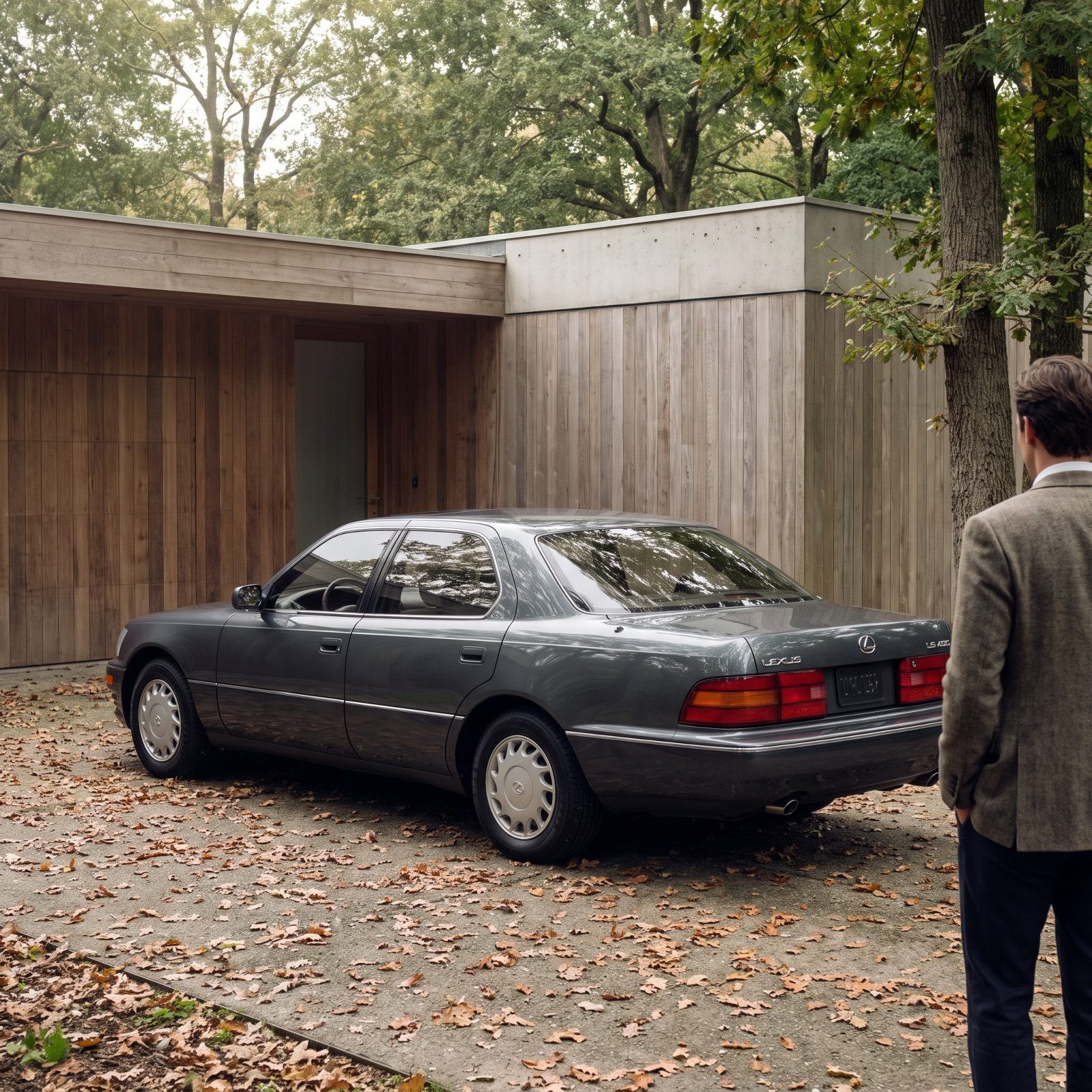
The first LS 400 said almost nothing. No bold grille, no aggressive lines, no attempt to announce its price. In 1990 some called that boring. Today it reads as quiet confidence — the car equivalent of a plain cashmere coat that cost more than the loud one.
Restraint is the hardest thing to date. There’s simply less here to go out of fashion, because the smooth flanks and modest chrome and balanced proportions were never tied to a trend, so no trend could leave them behind.
Say it plainly: the cars that tried least to impress are the ones still impressing us.
1991 Acura NSX: An Exotic Shape Without Visual Clutter
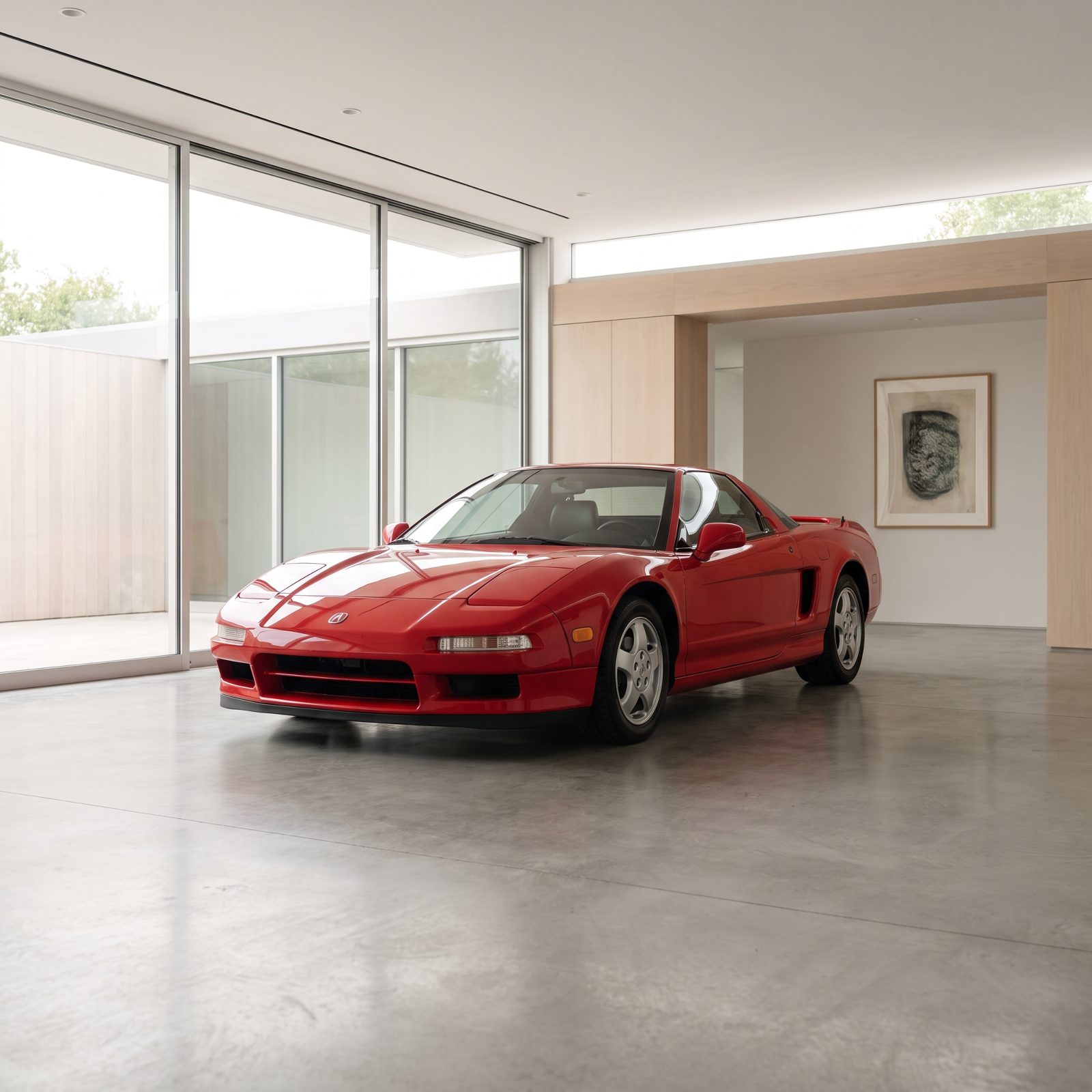
Honda built an exotic that didn’t need to shout about it. The NSX had the low, wide wedge you expect from a mid-engine car, but the panels stayed clean — no fender slashes, no scoops bolted on to prove a point. One shoulder line runs the length of the body and that’s the whole vocabulary. Look at a Ferrari from the same years and then look at this, and you start to wonder why anybody thought vents everywhere counted as design. The glass area is generous, the proportions are honest, and decades later the shape hasn’t aged into embarrassment. That restraint is rarer than horsepower.
First-Generation Porsche Cayenne: Strong Proportions Undone by Its Face
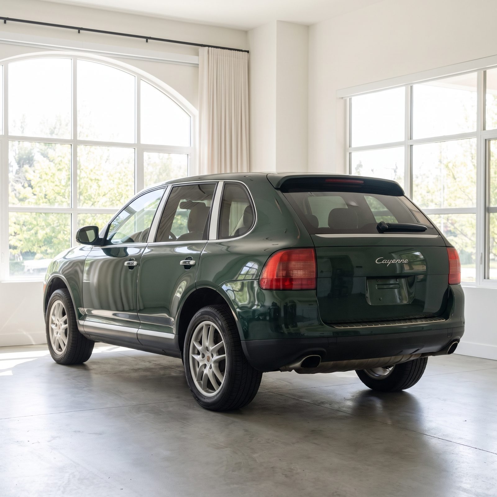
From the doors back, the first Cayenne is a genuinely good-looking truck. Long roofline, planted stance, wheels that actually fill the arches the way Porsche intended. Then your eye reaches the front end and everything falls apart. The headlamp clusters look like they wandered over from a different, unhappier vehicle, and the lower bumper piles on cladding until the transition from hood to grille turns into a shrug. People hated it when it landed, and honestly? They weren’t wrong about the face. The body never deserved the hate the nose earned — strong sides fighting a busy front, and the front winning.
1998 Audi TT: A Single Design Idea Carried All the Way Through

Circles. That’s the whole game. The TT took one geometric idea and committed to it so completely that the roof arc, the fender domes, the round details inside and out all answer to each other. Nothing argues. Nothing feels tacked on because the designers found a late idea they liked. You could draw the thing from memory, which is the sign a shape actually works — most cars you can’t, because there’s nothing holding them together. The TT held together from the first sketch to the last fastener, and that kind of discipline is why it still looks right.
2002 Mini Cooper: Retro Design With Its Own Coherent Shape
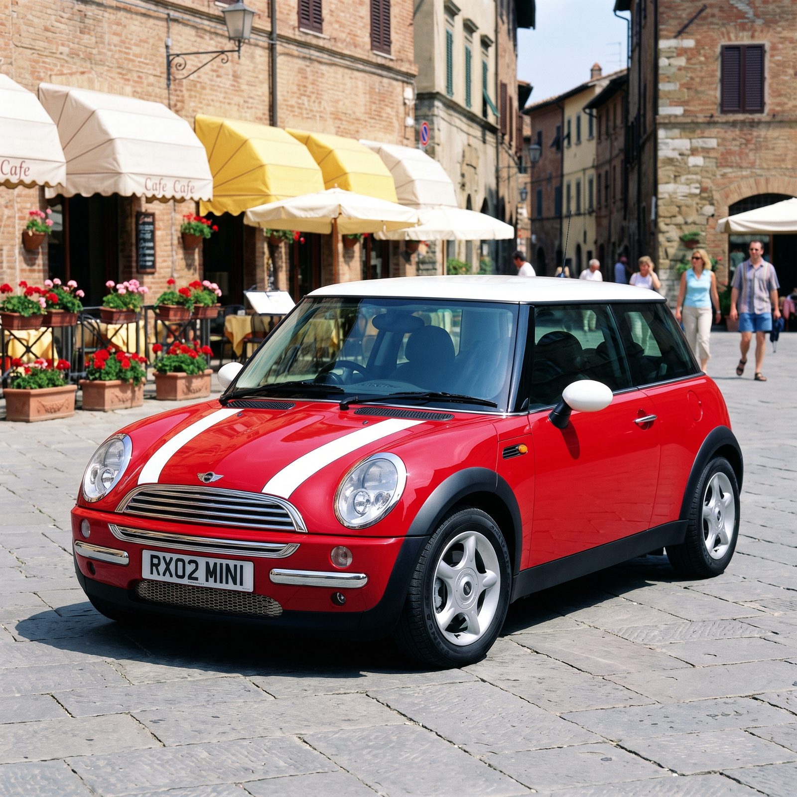
Reviving a legend usually goes one of two ways: slavish copy or arrogant reinvention. The 2002 Mini dodged both. It nods hard at the 1959 original — the stance, the wheels jammed out to the corners, the big round eyes in the clamshell hood — but it never pretends to be a replica. The proportions are its own. Short, upright, airy up top, with chrome catching the light around the grille. Plenty of retro cars from that era look like costume parties now. This one still reads as a real design that happened to remember where it came from.
2005 Ford GT: A Revival That Preserved the Original Visual Logic
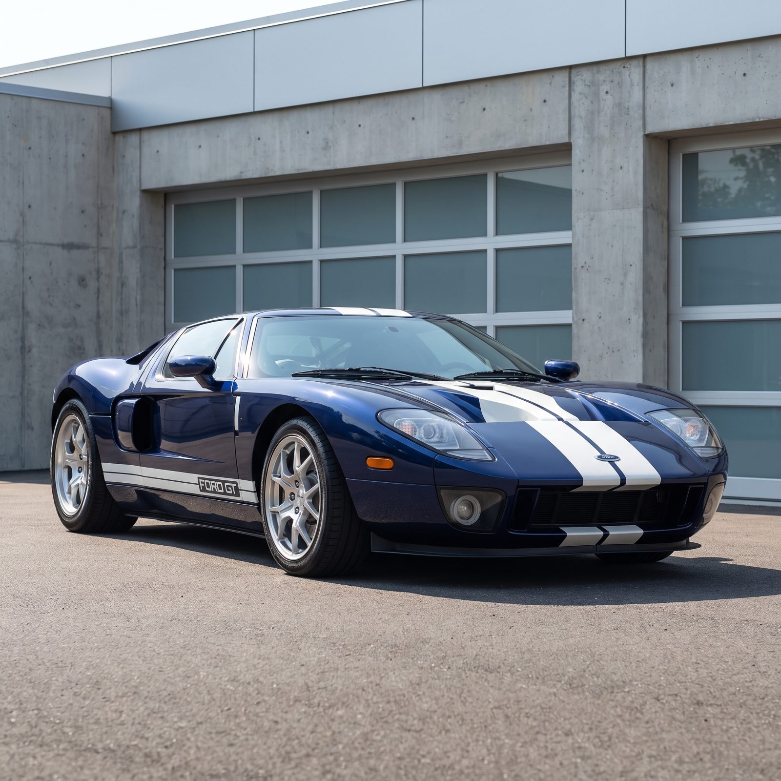
The GT40 is holy ground, and Ford knew it. When they brought the shape back in 2005 they didn’t update it so much as translate it, keeping the long flat hood, the round quad lamps, the shallow cabin sitting low between wide haunches. Everything that made the 1960s racer look like it was moving while parked survived the trip. It’s bigger than the original had to be, sure, and the modern crash rules show here and there. But the logic held. You look at it and the lineage is obvious without anybody having to tell you, which is exactly what a revival is supposed to pull off and almost never does.
2012 Tesla Model S: Smooth Surfaces Before Electric-Car Gimmicks

The early Model S was quietly handsome. A long fastback, a single soft shoulder line, door handles that sat flush, and a nose that still wore a modest black nose cone where a grille used to go. No fake vents. No desperate signaling that this was The Future. It just looked like a well-drawn sedan, which was the point — before electric cars started competing to see who could stare the hardest. The surfacing did the work and left it at that. Later editions traded that calm for gadgetry, so the 2012 car ended up being the cleanest the family ever looked.
AMC Pacer: Awkward in Period, Lovable Once Its Context Changed
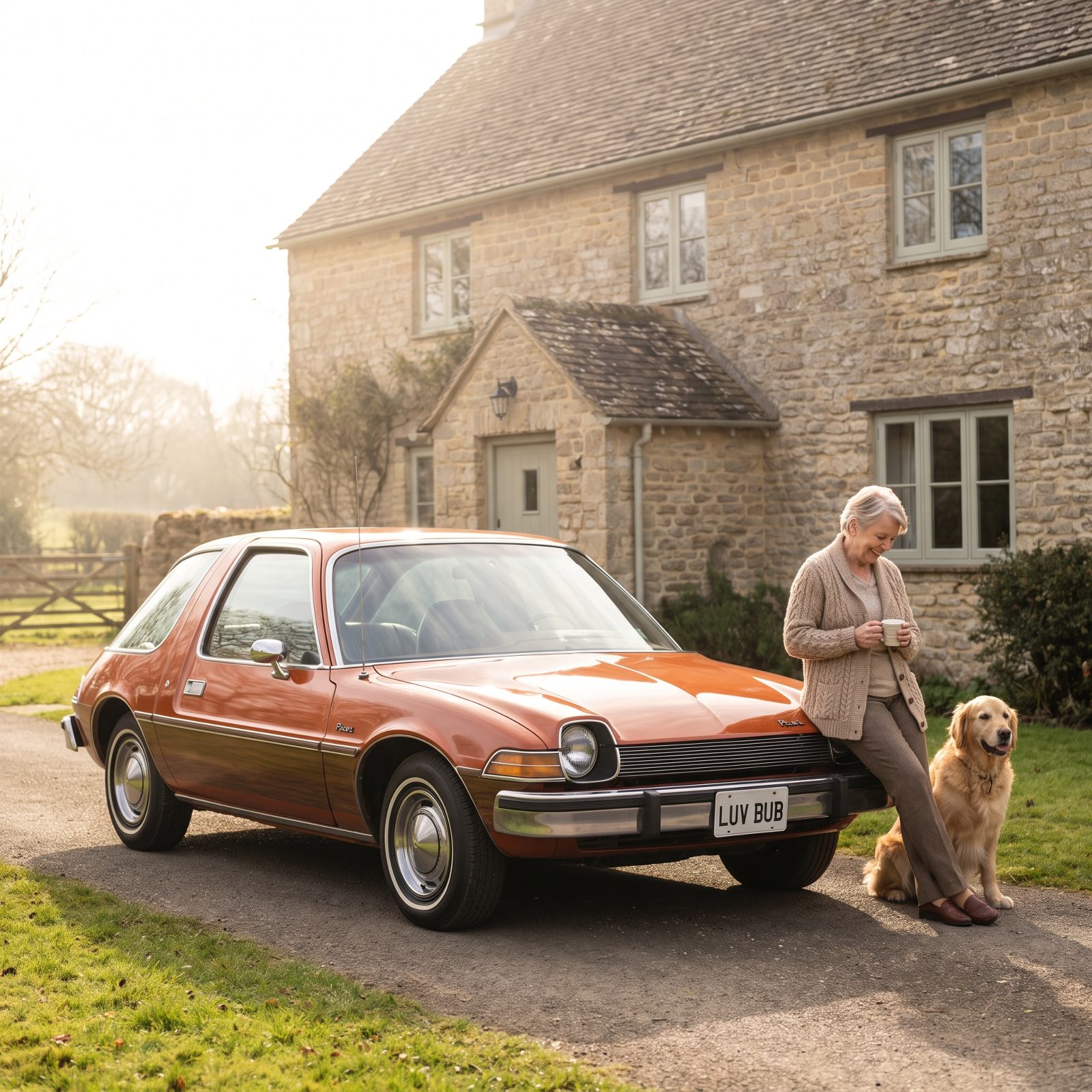
In 1975 the Pacer looked like a mistake nobody caught in time. All that curved glass, the bulbous body, the greenhouse wrapping around like somebody designed a car inside a fishbowl — against the square sedans of the day it just read as wrong. Wide, short, weird. Then time did what time does. Once the context changed, the oddness stopped being a flaw and became the whole charm. Wayne’s World didn’t hurt, either. Now you spot one and smile instead of squint, and the fishbowl glass that embarrassed it in period is exactly why people love the thing today.
Isuzu VehiCROSS: Plastic Cladding That Now Feels Purposeful
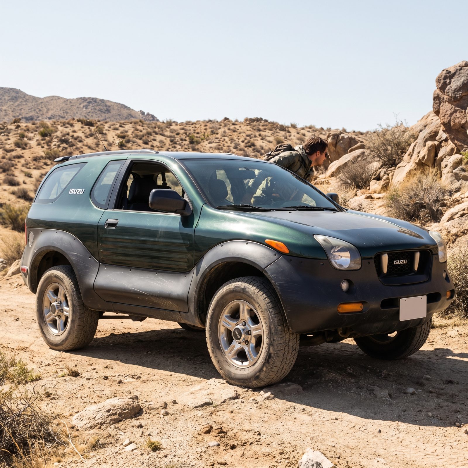
Black plastic cladding was the punchline of an entire era. Bolt enough of it onto a soft crossover and you got a vehicle pretending to be tough while never leaving the mall lot. The VehiCROSS is the odd exception, because its cladding wasn’t pretending. This was a genuinely capable off-roader, compact and planted, and the matte charcoal armor wrapping the doors and arches actually did a job. Context is everything here. The same material that looked cynical everywhere else looks honest on this truck, and that’s part of why a once-weird Isuzu now has a following that takes it seriously.
Plymouth Prowler: Exposed-Wheel Drama That Became Collectible Theater
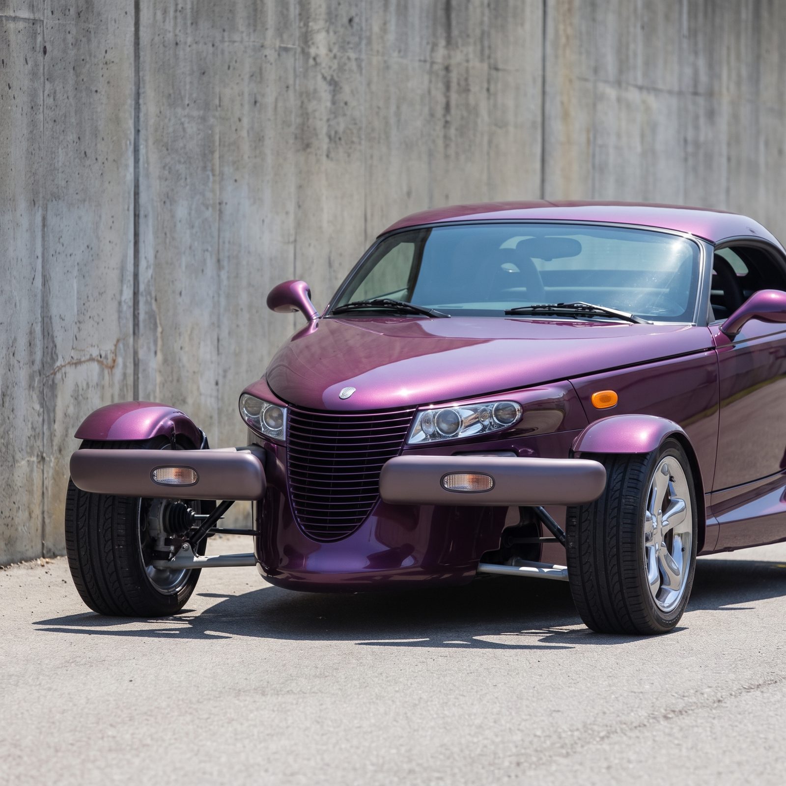
Chrysler built a hot rod and dared you to take it seriously. The Prowler put its front tires right out in the open on slim chrome arms, ran a pointed boat-tail nose, and basically wore its influences on the hood for everyone to see. Half the enthusiasts groaned — a V6 in a rod? — and the other half couldn’t look away. The thing is pure theater, and it never pretended otherwise. That honesty is why it works as a collectible now. You don’t buy a Prowler expecting a sleeper. You buy it because nothing else on a dealer lot in 1999 looked remotely like it, and nothing since has had the nerve to try.
Toyota 2000GT: Scarcity and Proportion Preserved Its Beauty
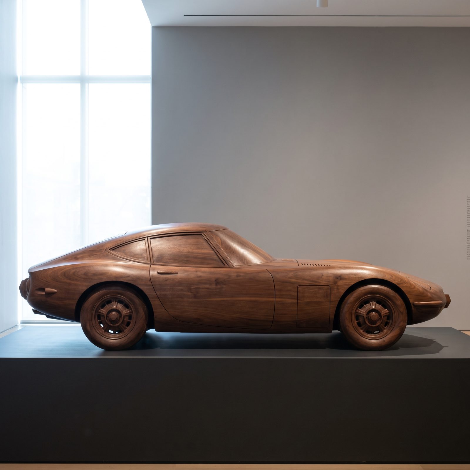
Only a few hundred ever left the factory, and every one of them looks like it was carved rather than stamped. The 2000GT has the long low hood, the delicate fastback, the slim wire wheels and little chrome bumperettes — proportions so right they make you forget Toyota built it before anybody took Japanese sports cars seriously. It proved they could, and it proved it with grace instead of noise. Rarity kept it safe. There were never enough to beat up, badly restore, or ruin with cheap updates, so the survivors stayed close to perfect. Beauty plus scarcity is how you end up with one of the loveliest cars of its decade, untouched.
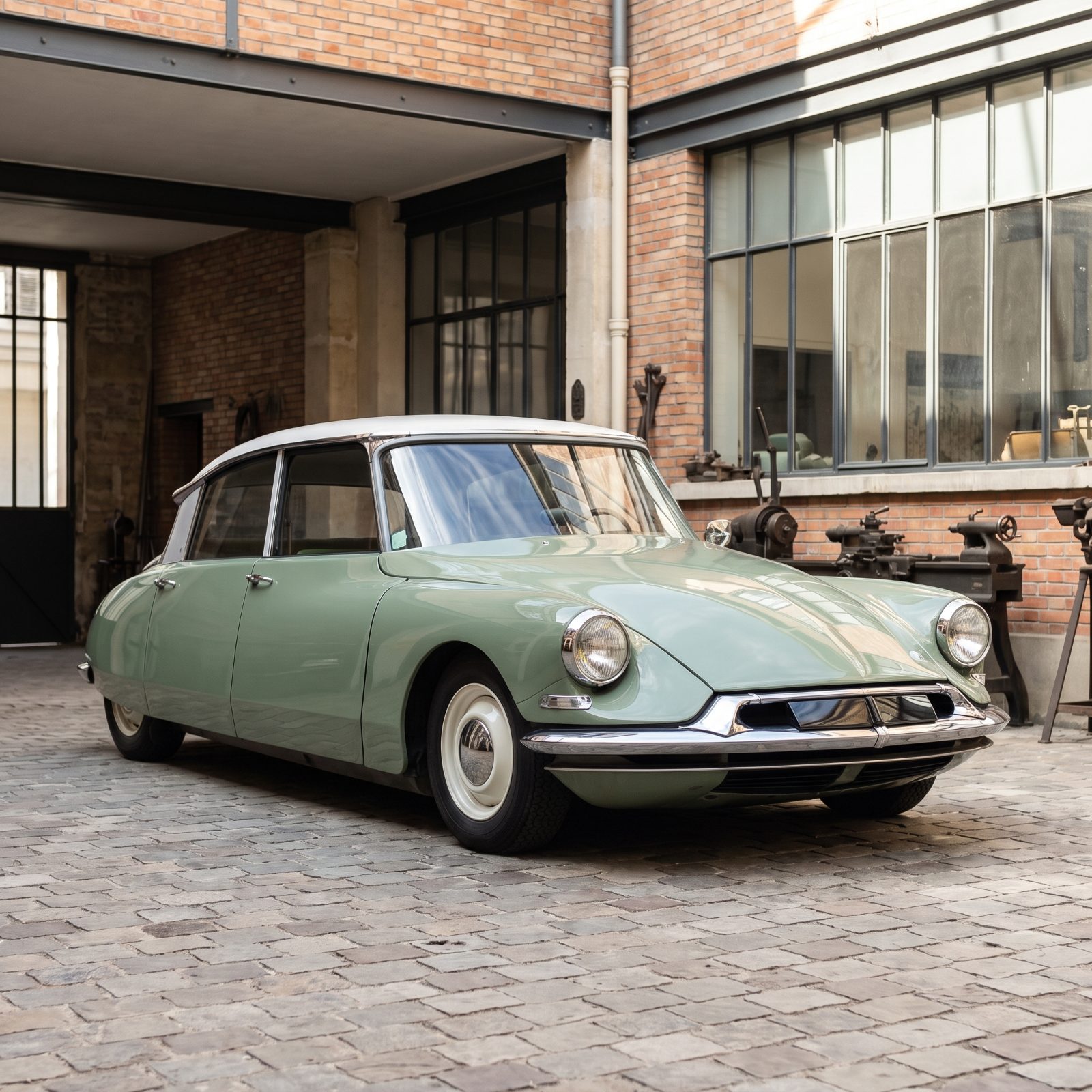
Citroën DS: When Engineering Gave the Shape Lasting Meaning